
Creating impactful infographics is a challenge that goes beyond choosing attractive colors and shapes. It’s about synthesizing complex ideas into clear and organized images that effectively communicate a message. To achieve this, it’s essential to plan content, structure information coherently, and select the right tools that facilitate this creative process.
The ecosystem of available apps is broad—and sometimes a bit overwhelming. That’s why it’s worth selecting those that really work for us and learning to get the most out of them, rather than constantly switching from one to another.
For many educators and content creators, creating infographics represents a unique opportunity to transform data and complex concepts into visual resources that facilitate understanding and learning. However, it’s common to feel overwhelmed by the number of available options and the difficulties in organizing information effectively.
In this article, we’ll explore two powerful AI-powered tools—Napkin AI and Piktochart AI—that not only simplify the design process, but also enhance creativity and customization, allowing you to create infographics that truly impact your audience.
The Challenge of Creating Good Infographics
Now, making a good infographic isn’t as simple as it seems. You can start enthusiastically: “I’ll throw together something quick with some icons and call it done”. But soon the obstacles appear:
- How do I synthesize without losing depth?
- How do I organize information visually so it’s understood?
- How do I make it look professional without being a designer?
An effective infographic doesn’t just show data, it tells it with meaning, aesthetics, and order. And for that, we need tools that support us, not frustrate us.
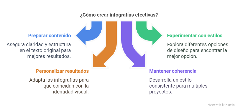
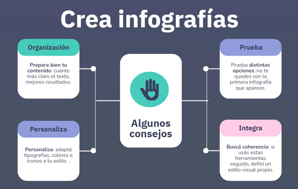
Some Helpful Tips
- Prepare your content well: the clearer the text, the better the results.
- Try different options: don’t settle for the first infographic that appears.
- Personalize: adapt fonts, colors, and icons to your style.
- Seek consistency: if you use these tools regularly, define your own visual style.
- Combine tools: for example, use Napkin to organize ideas and Piktochart for final design.
Featured Tool: Napkin AI
This is where Napkin comes in, an AI-powered application that helps us transform ideas and information into clear and attractive visual diagrams. It doesn’t replace our thinking, but it does organize our thoughts.
How does it work?
Napkin offers three ways to work:
- From existing text: you copy and paste what you’ve already written.
- From a prompt: you tell it what you want to generate.
- Direct editing: you use its visual editor to create from scratch.
What does it offer?
- Automatic generation of different infographic models
- Custom editing (fonts, icons, colors, layout)
- Download in different formats
What makes it valuable?
- Saves time
- Improves clarity of what we want to communicate
- Helps visualize complex concepts without needing design knowledge
- Allows us to generate professional resources intuitively
Second Tool: Piktochart AI
As a complement to Napkin, Piktochart AI gets straight to the point: infographics, and nothing else. It’s ideal for creating eye-catching visualizations in no time, with polished design adapted to different uses.
How does it work?
- You write a topic or paste your content
- AI shows you several visual options
- You choose the one that best fits what you want
- You customize text, colors, icons
- You export in PNG, PDF, HTML, etc.
Advantages
- Total specialization in infographics
- Professional templates ready to use
- Very easy to use (no design knowledge needed)
- Quality visual results in minutes
- Export in different formats for different platforms.
In Summary
It’s not about using more tools, but about choosing the ones that best help you meet your needs. If you take some time to explore, you’ll likely find more agile and creative ways to tell what you do.